Sometimes you have to dynamically resize the font size based on browser scale. Its called font scale with screen size. In this post I will explain how can you achieve the behavior of font resizing on browser scaling.
Prerequisites
As I am going to explain it in an Angular application, so I believe you have Angular installed on your machine. So start with creating a blank Angular application.
Step 1 – create an app and a component
Create an Angular application and a component inside that. We can use the App Component as well.
Step 2 – put html and css
app.component.html
<h1>Hello Angular</h1>

<p class="dynamic-font-size">
  Dynamic font resize will happen in this text
</p>
app.component.scss
$mqIterations: 19;
@mixin fontResize($iterations)
{
  $i: 1;
  @while $i <= $iterations
  {
    @media all and (min-width: 100px * $i) {
      .dynamic-font-size  { font-size:0.25em * $i; }
    }
    $i: $i + 1;
  }
}
@include fontResize($mqIterations);

p, h1 {
  font-family: Verdana, Geneva, Tahoma, sans-serif;
}
If you notice above code, we have used scss file so that I can put some calculate-able css inside it and that will help us create the classes for all the iterations. There is 19 iteration I have put and in each iteration I set 100px incremented / decremented media query.
Here is a working code for you to look into it I have put on Stackblitz.
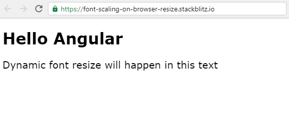
Attached some screenshots below:-


Write me up for any query you get.
Thank you!

